If some of you missed it, Google's April fools joke this year was to rename their search engine Topeka which is a nod to the fact that Topeka renamed itself Google as part of their creative bid for Google fiber. I say that will be quite a consolation prize for Topeka when they lose the bid to Grand Rapids which is unarguably a cooler place.
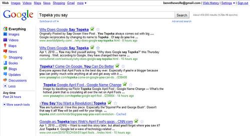
So on the heels of that headline Google also just changed their SERP (search engine results page). I have kind of been out of it for the last couple of days, but I think it might have just been introduced. Anyways, whenever it came out, I really like the redesign. Let me show you a screeny if you are too lazy to actually perform a search yourself.
So there's your basic SERP that you will see most of the time. It's strikingly simple and elegant. My first thought, literally when I first saw it today was, “Whoa, where am I? What is this.” which is a pretty strong response versus the normal complete ambivalence towards everything except the top two organic results.
(Oh ha, I just noticed that I didn't turn my plugins off, so those stars and green check marks are not part of the redesign, and you won't see those on your screen.)
In general, this page just looks so much more attractive than it ever has before. I can't really put my finger on it but everything is just more appealing. From the glitzy, well-proportioned, brightly colored icons on the left to the dazzlingly crisp and legible query bar everything is just pumped up. I really like it.
Looking around though, I found that they have actually added some interesting usability features that I'm really excited about. Their great use of fly-open menus which allow you to easily refine your results. Some might think, well, we could do that at the top by clicking images. Yes, but now not only can you refine by media type, you can actually refine by publication method in addition. This is in my opinion an enormous leap forward and a great and timely innovation in this day of rampant microblogging. So now we can search and find things like you would find on twitter, or change to blogs, and find things like you'd find on Digg, or change to images, and find things like you'd find on flickr. That makes Google one stop shopping like it's never been.
I also wanted to see if it would still look as pretty for a search with sponsored links.
Although the sponsored links are a little annoying, I think they are much less so than they were. In doing this search and a few others, I found some things that I didn't expect. First, the default refining choices seem to be intelligently selected based on your search query. For example, in my search for temporary airbrush tattoos you see that shopping was at the top of the list just below "everything", and actually shown by default, while in my search for "Topeka" News and Maps were at the top of the list and shown by default while shopping was hidden inside the toggle-down menu.
I found a similar behavior for the filter by time criteria which seemed to be equally intelligent and just as an exciting refinement. Say for example, that I were to search for "what the maximum level for properties is in mafia wars" which I did earlier tonight, and I know that they just changed their system today, so the only relevant hits will have been published in the last 24 hours, I can skip all of the crap (which will be ranked higher for that search query) and get down to the new, hot, current stuff.
I'd love to hear what you guys think of the redesign, as all in all, I really like it. Not as much as I like Mindy and my wedding blog redesign but hey, only one person can be that awesome *wink.
PS. The RSVP form is open on our blog, so if you want to come feel free to RSVP.


It's good to see you blog. :-) I honestly didn't really notice the change in the Google layout thing, but then again, I wasn't really paying attention, lol.
ReplyDeleteYou might not have it. From what I've been reading it is a soft launch, released slowly over time.
ReplyDeleteThanks for commenting.